Harvest Urban Market
Identity | signage and interior wayfinding | product labeling | packaging, bag design | uniforms
When Harvest Ranch Market in San Francisco’s Castro district (they were Whole Foods before there was a Whole Foods) made plans to build a new location in SOMA, they tapped us to work with their architectural firm and brand the location from the ground up. We worked on teaser construction signage and interior wayfinding systems, right through product labeling, packaging and uniforms.
Harvest Ranch Market, an established Castro neighborhood favorite, required rebranding as they grew into their larger second location in SOMA. The original logo reflects Harvest’s health-food store origins.
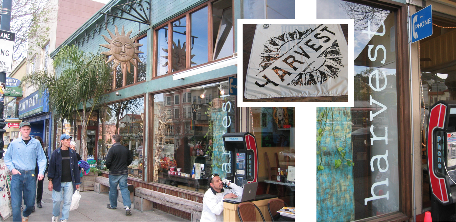
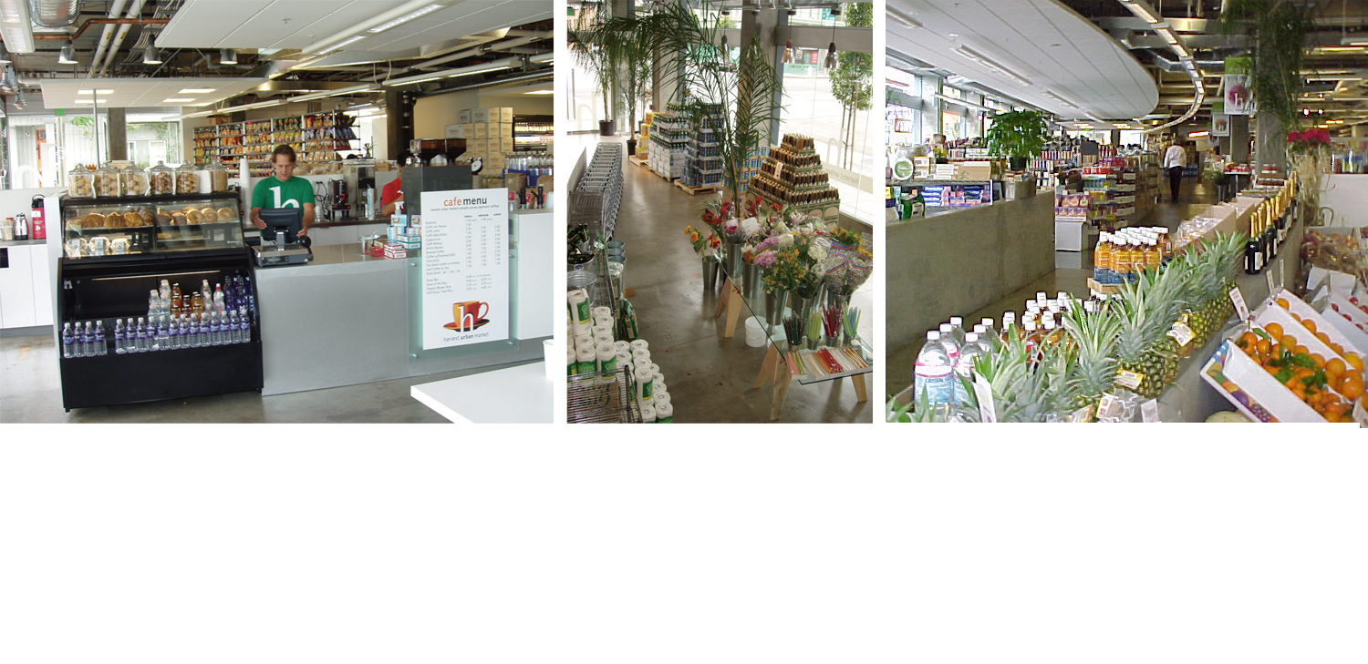
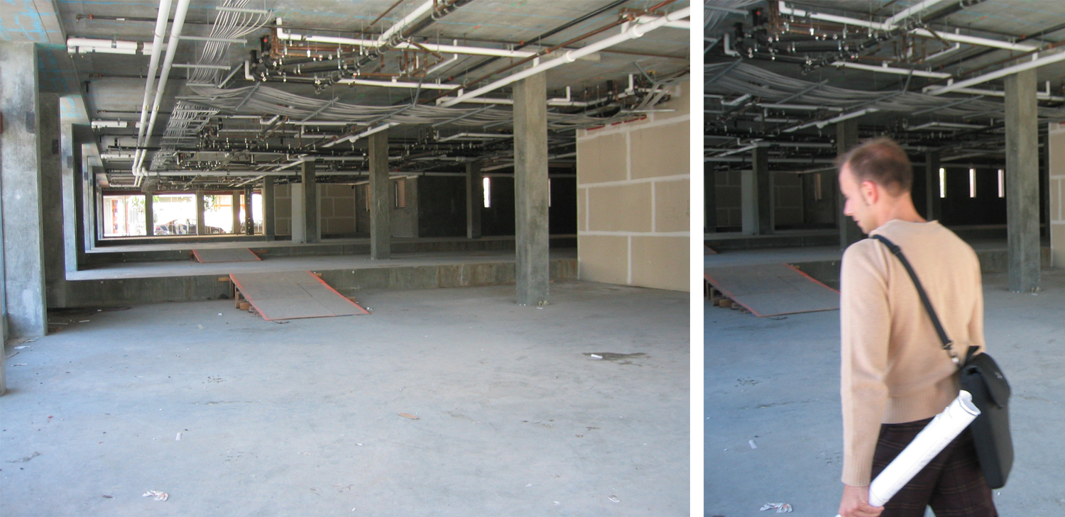
The new SOMA space, to be called Harvest Urban Market, was significantly larger, more open, more industrial. We worked with the architectural firm from day one to synchonize our efforts and develop a unified, spare look that put the spotlight on the goods the market planned to feature.
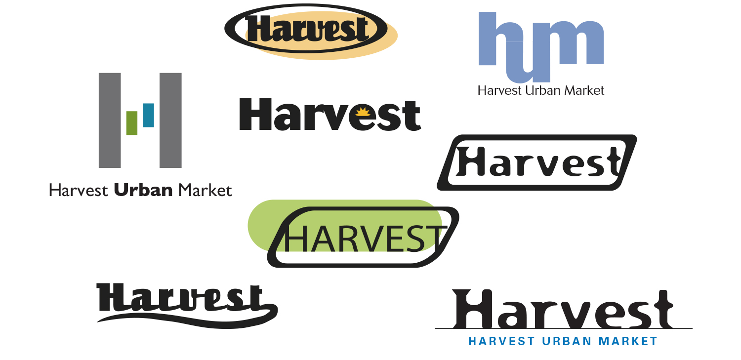
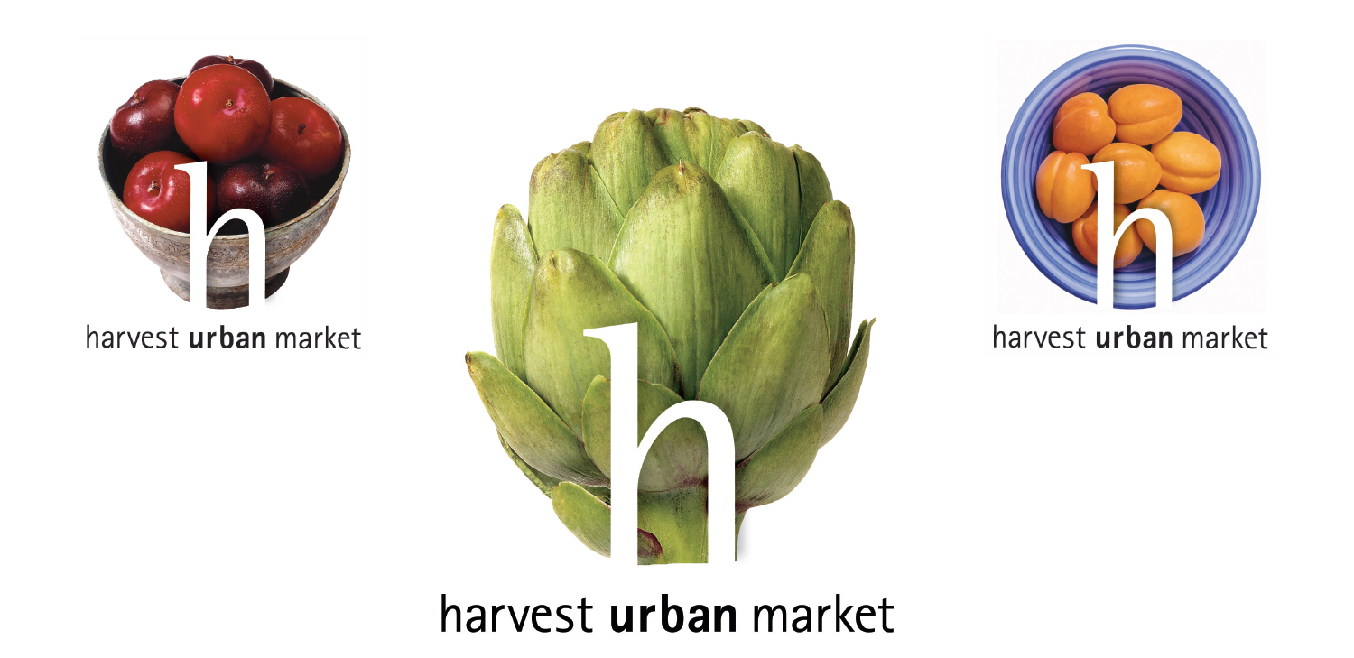
Logo exploration
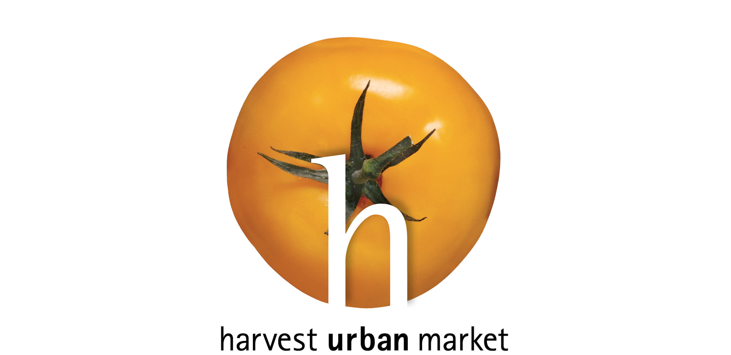
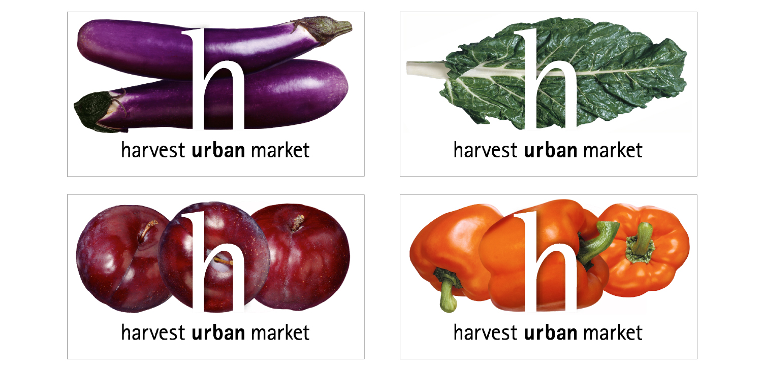
The final identity was a family of changing logos where the “h” for Harvest (lowercase to be friendly and informal) is defined by the fresh produce the store offered.
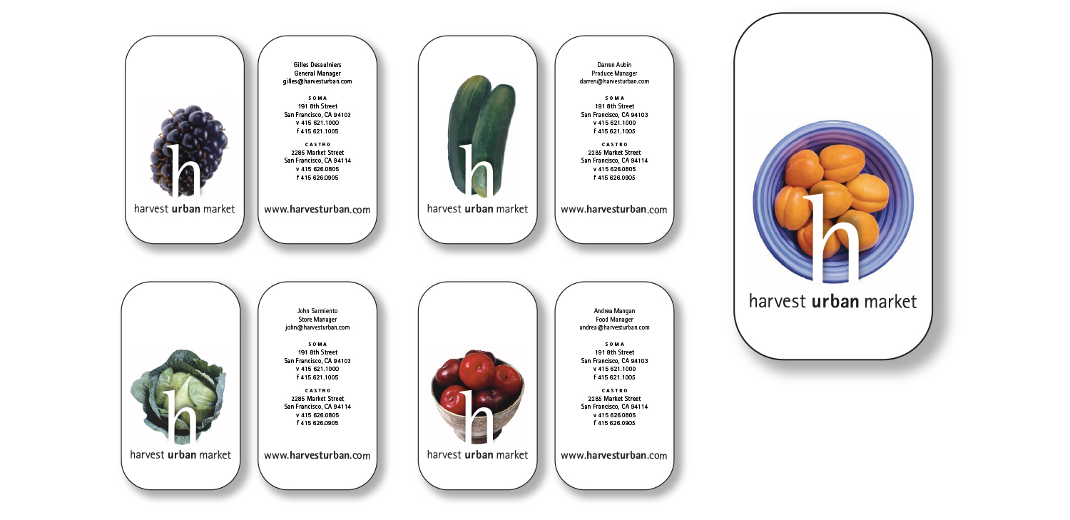
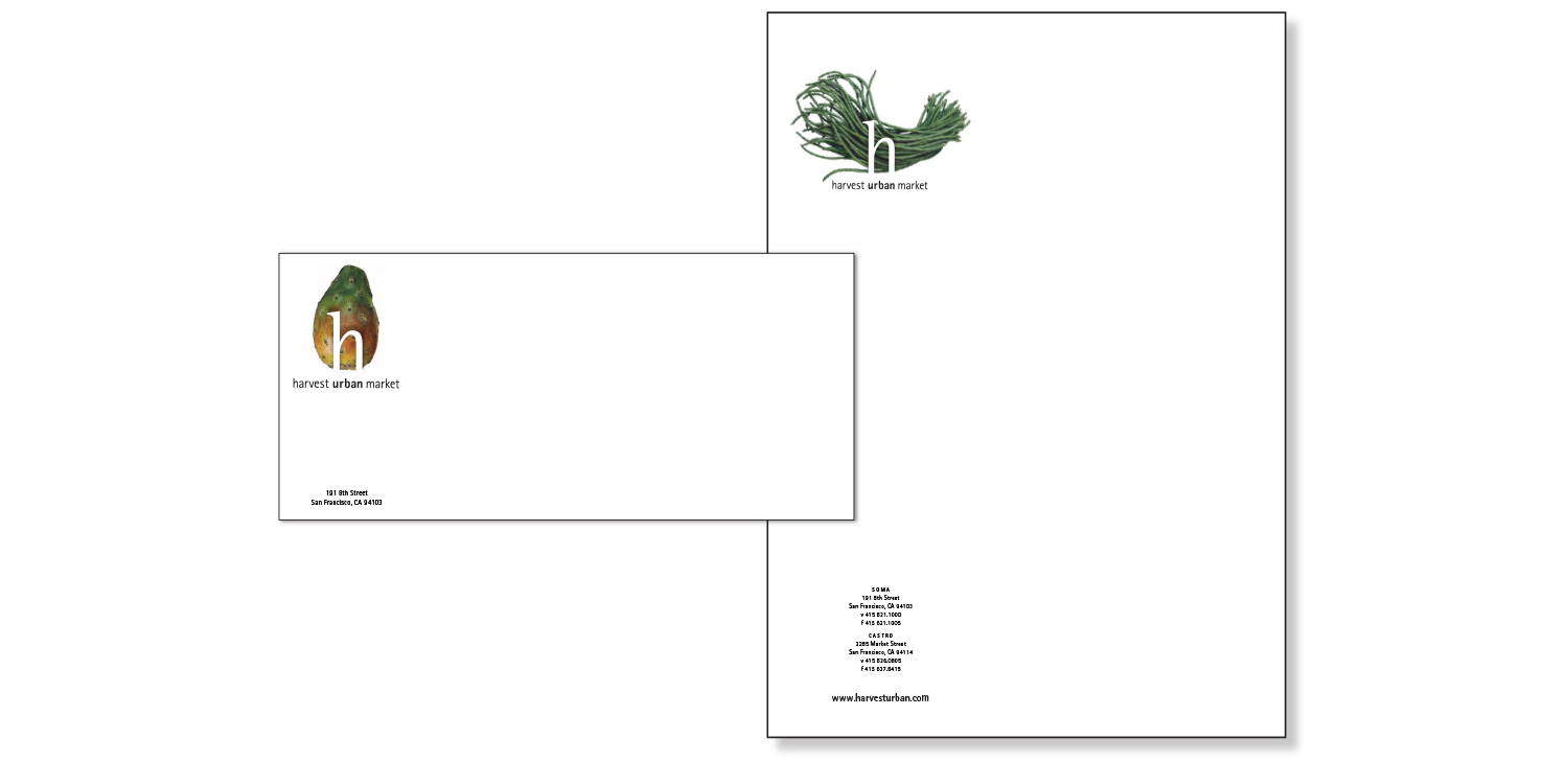
Business cards, letterhead, envelopes
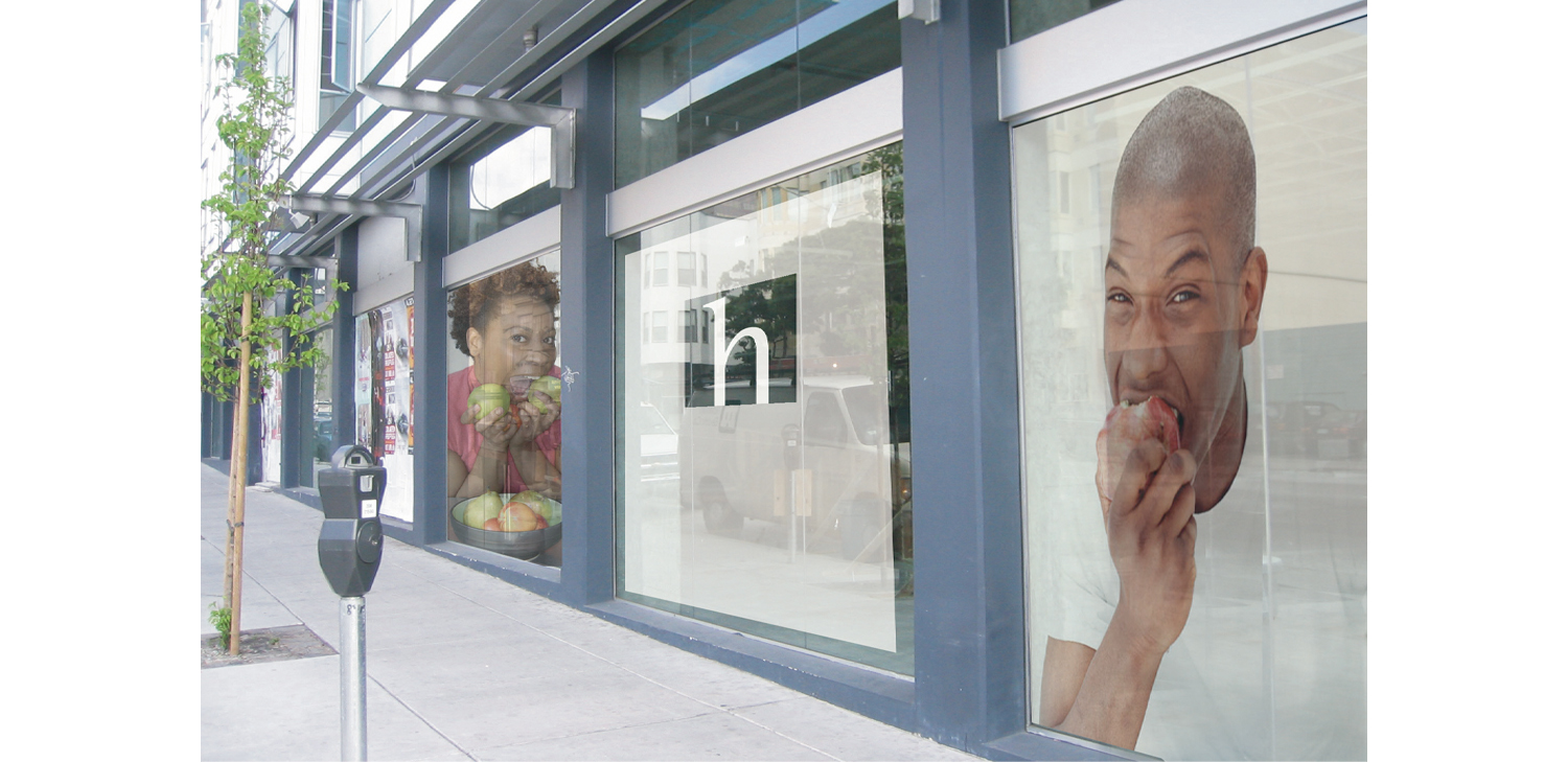
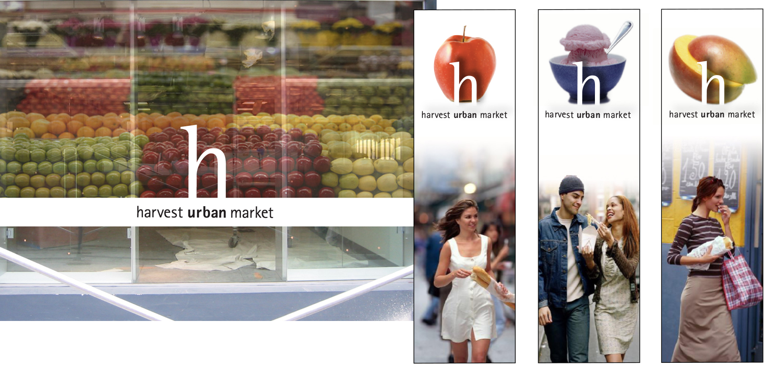
During construction, temporary window films set the tone and acted as teaser advertising.
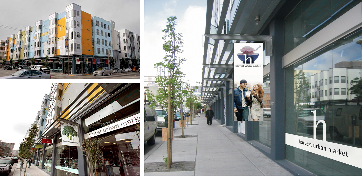
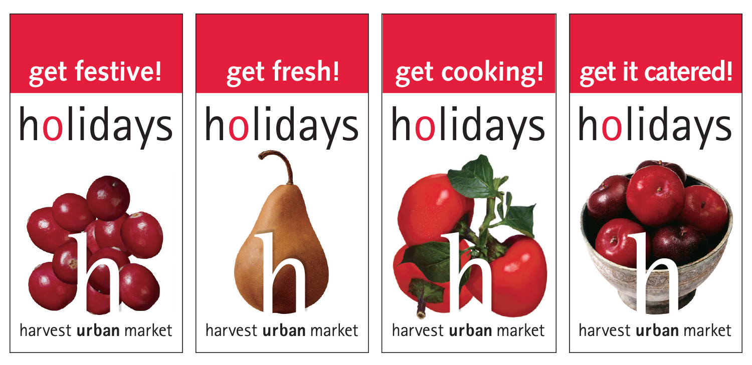
The final exterior signage consisted of window films and hanging banners wrapping around 2 sides of the corner store.
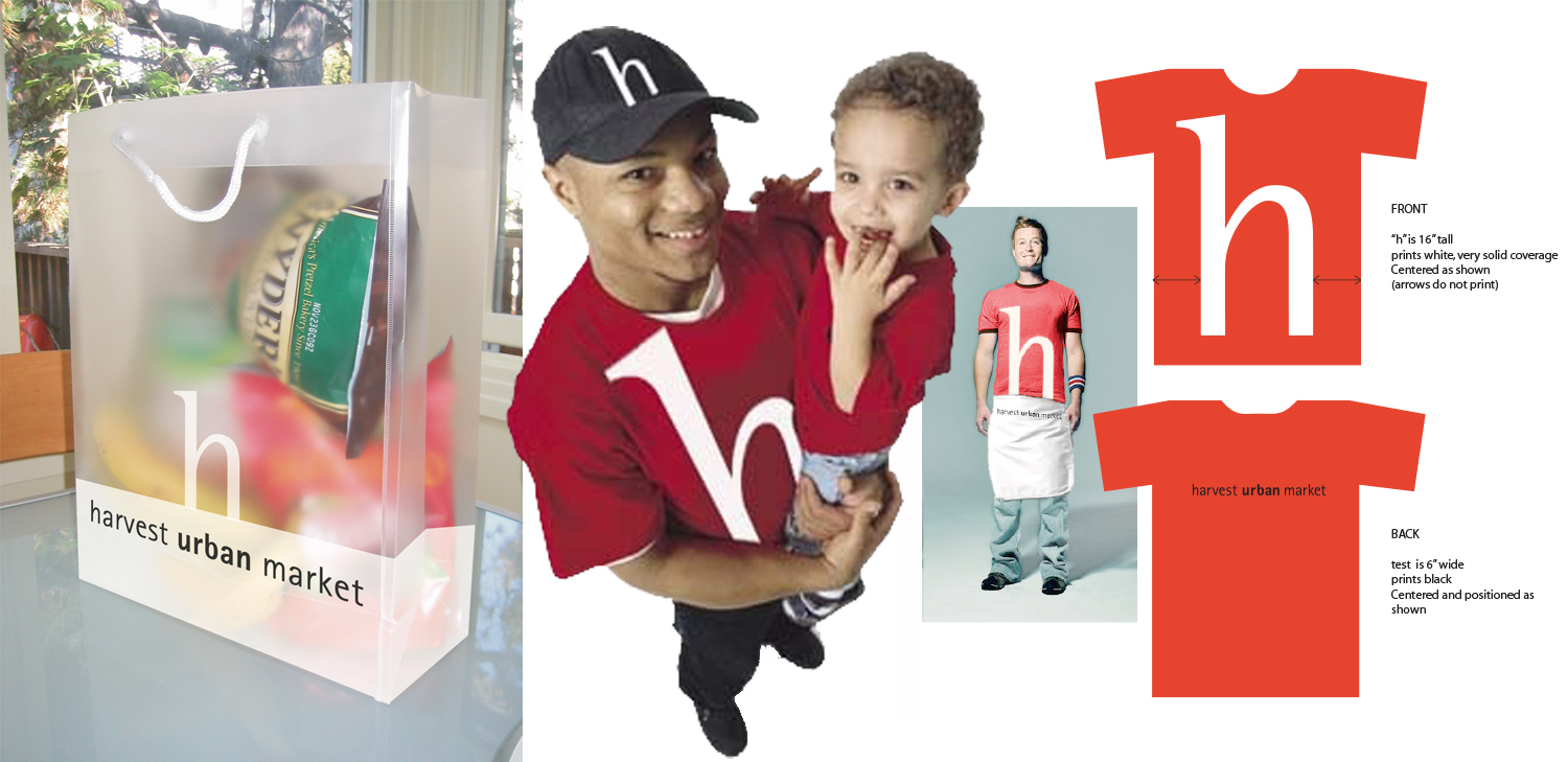
High quality reusable shopping bags; uniforms
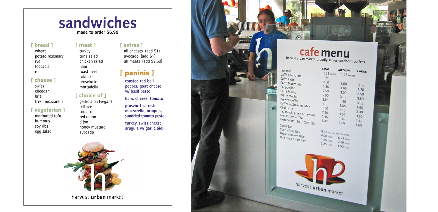
Interior signage and menu boards
The final market was extremely well received, a great addition to a rapidly expanding neighborhood. In the SF Chronicle, their respected architecture critic John King wrote this: “The market glowed like an airy mirage; above it danced the mural’s syncopated mix of orange and yellow, lime green and sky blue… The vision would be startling anywhere. Here, in a drab stretch of the South of Market district where long blocks are flat and gray, it jumps out and shines — radiating confidence that a community can blossom.”
